L1: Time in epidemiology: Questions and parameters
Readings
- Samet JM. Concepts of time in clinical research. Annals of internal medicine. 2000 Jan 4;132(1):37-44.
Notes
Below is the code to produce line diagrams for each scenario described at the end of the notes. Please check out the course notes and attempt the scenarios outlined there by hand (using pencil and paper) before looking at the answers posted here.
Say have a (small) cohort study of 5 soldiers selected at random from all people enlisting in the armed services between 2004 and 2014 and followed for mortality up to 10 years.
| id | age | enlist | last_info | vital_status |
|---|---|---|---|---|
| 1 | 24 | 2008-07-01 | 2022-01-13 | alive |
| 2 | 18 | 2008-07-01 | 2011-01-01 | dead |
| 3 | 21 | 2011-01-01 | 2016-06-15 | dead |
| 4 | 35 | 2011-01-01 | 2022-01-13 | alive |
| 5 | 19 | 2013-07-01 | 2022-01-13 | alive |
Practice drawing 3 line diagrams:
- one with age (starting at age 18) on the \(x\) axis
- one with calendar time (starting 1 Jan 2008) on the \(x\) axis
- one with time since enlistment on the \(x\) axis.
id <- c(1:5)
age <- c(24, 18, 21, 35, 19)
enlist <- c(as.Date("2008-07-01"),
            as.Date("2008-07-01"),
            as.Date("2011-01-01"),
            as.Date("2011-01-01"),
            as.Date("2013-07-01"))
last_info <- c(Sys.Date(),
               as.Date("2011-01-01"),
               as.Date("2016-06-15"),
               Sys.Date(),
               Sys.Date())
vital_status <- c("alive", "dead", "dead", "alive", "alive")
dat <- tibble(id, age, enlist, last_info, vital_status)

#line diagram 1
dat$t1 <- (last_info - enlist)/365.25 + age
dat$w1 <- age
dat <- dat %>%
  mutate(delta1 = ifelse(vital_status == "dead" & t1<=(age+10), 1, 0))
#library(grid)
library(ggthemr)
ggthemr('flat')
line <- ggplot() +
 # geom_segment(aes(x = 0, y = newid, xend = yearw, yend = newid), lty = "dotted") +
  geom_segment(data = dat %>% filter(delta1 == 0),
               aes(x = w1, y = id, xend = t1, yend = id),
               arrow = arrow(length=unit(0.2, "cm"))) +
  geom_segment(data = dat %>% filter(delta1 == 1),
               aes(x = w1, y = id, xend = t1, yend = id)) +
  ylab("ID") +
  scale_x_continuous(name = "Age" ) +
   geom_point(data = dat %>% filter(delta1 == 1),
              aes(x = t1, y = id),
              color = "red", size = 1.5)

line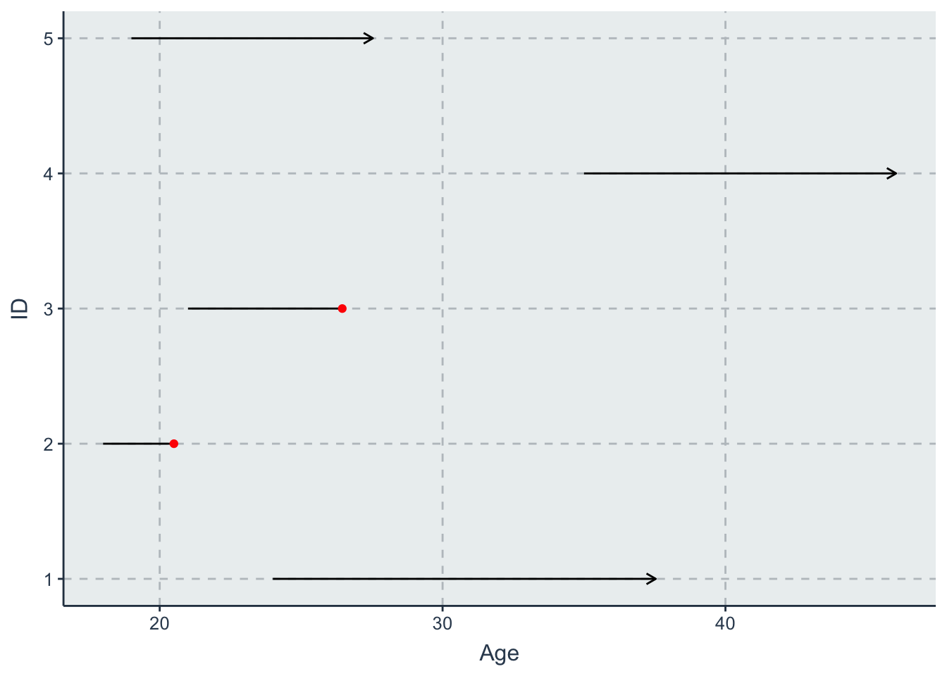
#line diagram 2
dat$t2 <- (last_info)
dat$w2 <- enlist
dat <- dat %>%
  mutate(delta2 = ifelse(vital_status == "dead" & t2<=(enlist+10*365.25),
                         1, 0))
line <- ggplot() +
  geom_segment(data = dat %>% filter(delta2 == 0),
               aes(x = w2, y = id, xend = t2, yend = id),
               arrow = arrow(length=unit(0.2, "cm"))) +
  geom_segment(data = dat %>% filter(delta2 == 1),
               aes(x = w2, y = id, xend = t2, yend = id)) +
  ylab("ID") +
  scale_x_date(name = "Calendar Date" ) +
   geom_point(data = dat %>% filter(delta2 == 1),
              aes(x = t2, y = id),
              color = "red", size = 1.5)

line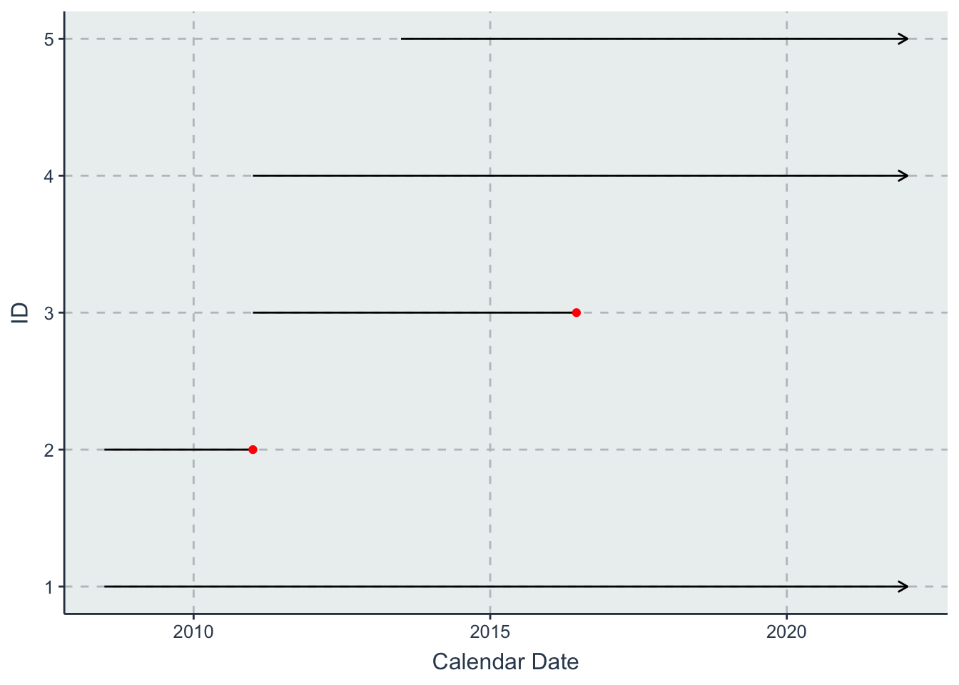
#line diagram 3
dat$t3 <- (last_info - enlist)/365.25
dat$w3 <- 0
dat <- dat %>%
  mutate(delta3 = ifelse(vital_status == "dead" & t3<=(10), 1, 0))

library(ggthemr)
ggthemr('flat')
line <- ggplot() +
  geom_segment(data = dat %>% filter(delta3 == 0),
               aes(x = w3, y = id, xend = t3, yend = id),
               arrow = arrow(length=unit(0.2, "cm"))) +
  geom_segment(data = dat %>% filter(delta3 == 1),
               aes(x = w3, y = id, xend = t3, yend = id)) +
  ylab("ID") +
  scale_x_continuous(name = "Years since enrollment") +
   geom_point(data = dat %>% filter(delta3 == 1),
              aes(x = t3, y = id),
              color = "red", size = 1.5)

line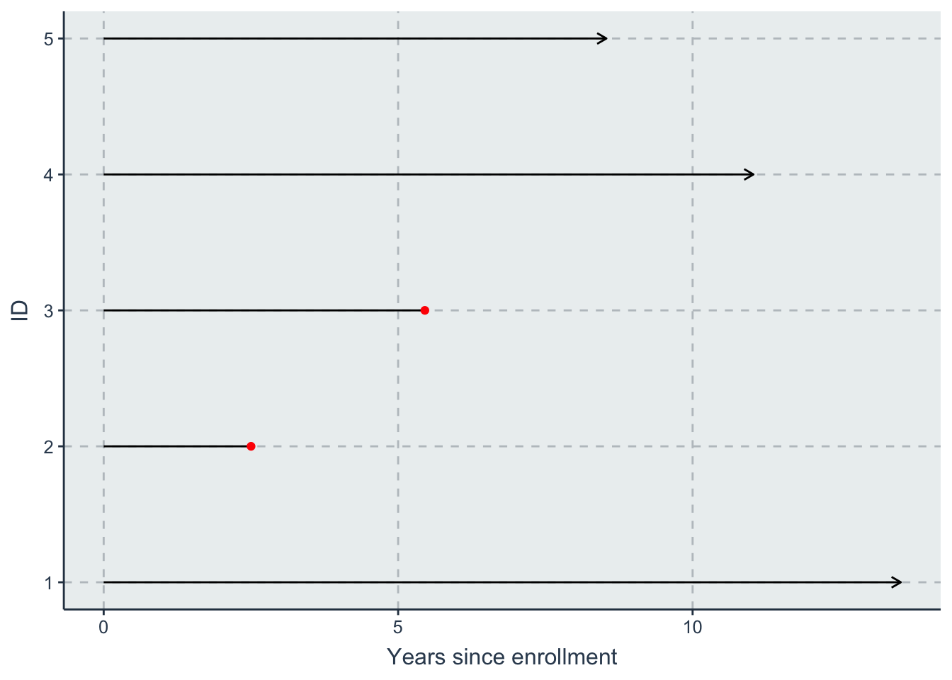
Videos
Recordings of lectures are available on the EPID 722 Sakai site.
Optional readings
Further reading about time in epidemiologic research:
Other resources
Parts of this week’s lecture are based on a talk I gave at SER in 2020.
Exercise
This week’s exercise, along with SAS and R code to get you started, is posted on the Microsoft Teams site for this course.
Questions
Please use the form below to submit your questions about this week’s reading.
Questions are due by Wednesdays at 5pm.